
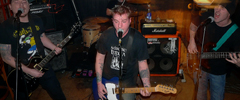
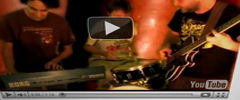
Well it's just about done. The major changes are finished but you will see smaller ones coming soon. RSS button, font color and size changes, ad space to pay contributors, and more. The need to redesign was to reduce the side gutter clutter and bring an aesthetic focus to media. The ideas that I was kicking around for the look was mainly how Zines look. And still, I am going to tweak it to get closer to that goal. Feel free to comment. The one drawback is those that still use lower monitor resolutions (1024 width and down) won't see the new design correctly. I am still working on that.





3 comments:
Thanks! I am going to put int he fivepoint light too later.
I have to say I love the header. And memorial park. And the subtle Zine feel.
Thats a really good idea, the 5 point light is another instantly recognizable feature of this city for those who know it well
Post a Comment